Thursday, October 7, 2010
First Quarter Test on October 15th!
Study up for the first quarter test. The test will be on art history, the elements and principles of art, and vocabulary.

Sketchbooks due on October 15th!
See previous post about sketchbooks to see sketchbook requirements. Notes in your sketchbook should indicate what you need to do to get the full 100 points. Sketchbook grades are 10% of your total grade.
Remember your "Miz Art" blog questions!
Remember your "Miz Art" blog questions!
Thursday, September 30, 2010
Frida Kahlo ~ Self Portrait Unit


"Frida Kahlo de Rivera (July 6, 1907 – July 13, 1954; born Magdalena Carmen Frieda Kahlo y Calderón) was a Mexican painter, born in Coyoacán. Perhaps best known for her self-portraits, Kahlo's work is remembered for its 'pain and passion', and its intense, vibrant colors. Her work has been celebrated in Mexico as emblematic of national and indigenous tradition, and by feminists for its uncompromising depiction of the female experience and form.
Mexican culture and Amerindian cultural tradition figure prominently in her work, which has sometimes been characterized as Naïve art or folk art. Her work has also been described as 'surrealist', and in 1938 one surrealist described Kahlo herself as a ribbon around a bomb'.
Kahlo had a stormy but passionate marriage with the prominent Mexican artist Diego Rivera. She suffered lifelong health problems, many of which stemmed from a traffic accident in her teenage years. These issues are reflected in her works, more than half of which are self-portraits of one sort or another. Kahlo suggested, 'I paint myself because I am so often alone and because I am the subject I know best.'"
http://en.wikipedia.org/wiki/Frida_Kahlo
Important Components of the Self-Portrait
Websites about Frida Kahlo:
http://www.fridakahlo.com/
Background
Expression
Clothing
Symbolism
Color
Direction of the eyes: Looking at the viewer (confrontational) or off into the distance.
Paint Instructions:
Paint background first THEN draw portrait on canvas.
Demo on flesh tones next week.
Pay attention to, and experiment with, your brushstrokes.
Care Instructions:
We are using ACRYLIC PAINTS!
DO NOT use oil paints!
Always wear apron and put newsprint or scrap paper under your work area.
Wash brushes thoroughly and put brush side up in the brush cup next to sink.
Only squeeze out enough paint for your work for the day: Don't waste!
If you have too much at the end of class, either cover it in plastic for use the next day OR scrape it out with a paper towel and WASH the palette.
Make sure you wash the palettes.
Clean up after yourself!
Plan your portrait:
1) Expression
2) Composition (where do you want to be placed in the portrait and how much of you will be visible)
3) Color
4) Background
5) Symbols
6) Direction of your eyes
Plan your portrait in your sketchbook. Address every component listed above.
Sketch out your portrait (or potential ideas).
IMPORTANT: If you missed this lesson (September 29th, 2010) then you MUST view the Smart Board lesson on Ms. Burnell's computer in your next art class.
Monday, September 27, 2010
Miz Art ~ Psychology of Color
Colors often have different meanings in various cultures. And even in Western societies, the meanings of various colors have changed over the years. But today in the U.S., researchers have generally found the following to be accurate.
Black
Black is the color of authority and power. It is popular in fashion because it makes people appear thinner. It is also stylish and timeless. Black also implies submission. Priests wear black to signify submission to God. Some fashion experts say a woman wearing black implies submission to men. Black outfits can also be overpowering, or make the wearer seem aloof or evil. Villains, such as Dracula, often wear black.

Albrecht Durer
Self Portrait
White
Brides wear white to symbolize innocence and purity. White reflects light and is considered a summer color. White is popular in decorating and in fashion because it is light, neutral, and goes with everything. However, white shows dirt and is therefore more difficult to keep clean than other colors. Doctors and nurses wear white to imply sterility.

Mary Cassatt
Self Portrait
Red
The most emotionally intense color, red stimulates a faster heartbeat and breathing. It is also the color of love. Red clothing gets noticed and makes the wearer appear heavier. Since it is an extreme color, red clothing might not help people in negotiations or confrontations. Red cars are popular targets for thieves. In decorating, red is usually used as an accent. Decorators say that red furniture should be perfect since it will attract attention.

Jacob Lawrence
Self Portrait
The most romantic color, pink, is more tranquilizing. Sports teams sometimes paint the locker rooms used by opposing teams bright pink so their opponents will lose energy.
Blue
The color of the sky and the ocean, blue is one of the most popular colors. It causes the opposite reaction as red. Peaceful, tranquil blue causes the body to produce calming chemicals, so it is often used in bedrooms. Blue can also be cold and depressing. Fashion consultants recommend wearing blue to job interviews because it symbolizes loyalty. People are more productive in blue rooms. Studies show weightlifters are able to handle heavier weights in blue gyms.

Vincent Van Gogh
Self Portrait
Green
Currently the most popular decorating color, green symbolizes nature. It is the easiest color on the eye and can improve vision. It is a calming, refreshing color. People waiting to appear on TV sit in "green rooms" to relax. Hospitals often use green because it relaxes patients. Brides in the Middle Ages wore green to symbolize fertility. Dark green is masculine, conservative, and implies wealth. However, seamstresses often refuse to use green thread on the eve of a fashion show for fear it will bring bad luck.

Frida Kahlo
Self Portrait
Yellow
Cheerful sunny yellow is an attention getter. While it is considered an optimistic color, people lose their tempers more often in yellow rooms, and babies will cry more. It is the most difficult color for the eye to take in, so it can be overpowering if overused. Yellow enhances concentration, hence its use for legal pads. It also speeds metabolism.

Bellany
Self Portrait
Purple
The color of royalty, purple connotes luxury, wealth, and sophistication. It is also feminine and romantic. However, because it is rare in nature, purple can appear artificial.

Andy Warhol
Self Portrait
Fun Fact: This painting just sold for $32.5 billion dollars at Sotheby's!
Brown
Solid, reliable brown is the color of earth and is abundant in nature. Light brown implies genuineness while dark brown is similar to wood or leather. Brown can also be sad and wistful. Men are more apt to say brown is one of their favorite colors.

Raphael
Self Portrait
Food for Thought
While blue is one of the most popular colors it is one of the least appetizing. Blue food is rare in nature. Food researchers say that when humans searched for food, they learned to avoid toxic or spoiled objects, which were often blue, black, or purple. When food dyed blue is served to study subjects, they lose appetite.
Green, brown, and red are the most popular food colors. Red is often used in restaurant decorating schemes because it is an appetite stimulant.
by David Johnson
Miz Art Question
Art I Students: What colors are you going to use in your portrait, and why?
Computer Graphics & Art II, III & IV Students: How will the knowledge of the psychology of color change your artwork? How will use color symbolically?
Read more: Color Psychology — Infoplease.com http://www.infoplease.com/spot/colors1.html#ixzz10jwCDYBT
Miz Art # 2 for week of 10/4/10
Black
Black is the color of authority and power. It is popular in fashion because it makes people appear thinner. It is also stylish and timeless. Black also implies submission. Priests wear black to signify submission to God. Some fashion experts say a woman wearing black implies submission to men. Black outfits can also be overpowering, or make the wearer seem aloof or evil. Villains, such as Dracula, often wear black.

Albrecht Durer
Self Portrait
White
Brides wear white to symbolize innocence and purity. White reflects light and is considered a summer color. White is popular in decorating and in fashion because it is light, neutral, and goes with everything. However, white shows dirt and is therefore more difficult to keep clean than other colors. Doctors and nurses wear white to imply sterility.

Mary Cassatt
Self Portrait
Red
The most emotionally intense color, red stimulates a faster heartbeat and breathing. It is also the color of love. Red clothing gets noticed and makes the wearer appear heavier. Since it is an extreme color, red clothing might not help people in negotiations or confrontations. Red cars are popular targets for thieves. In decorating, red is usually used as an accent. Decorators say that red furniture should be perfect since it will attract attention.

Jacob Lawrence
Self Portrait
The most romantic color, pink, is more tranquilizing. Sports teams sometimes paint the locker rooms used by opposing teams bright pink so their opponents will lose energy.
Blue
The color of the sky and the ocean, blue is one of the most popular colors. It causes the opposite reaction as red. Peaceful, tranquil blue causes the body to produce calming chemicals, so it is often used in bedrooms. Blue can also be cold and depressing. Fashion consultants recommend wearing blue to job interviews because it symbolizes loyalty. People are more productive in blue rooms. Studies show weightlifters are able to handle heavier weights in blue gyms.
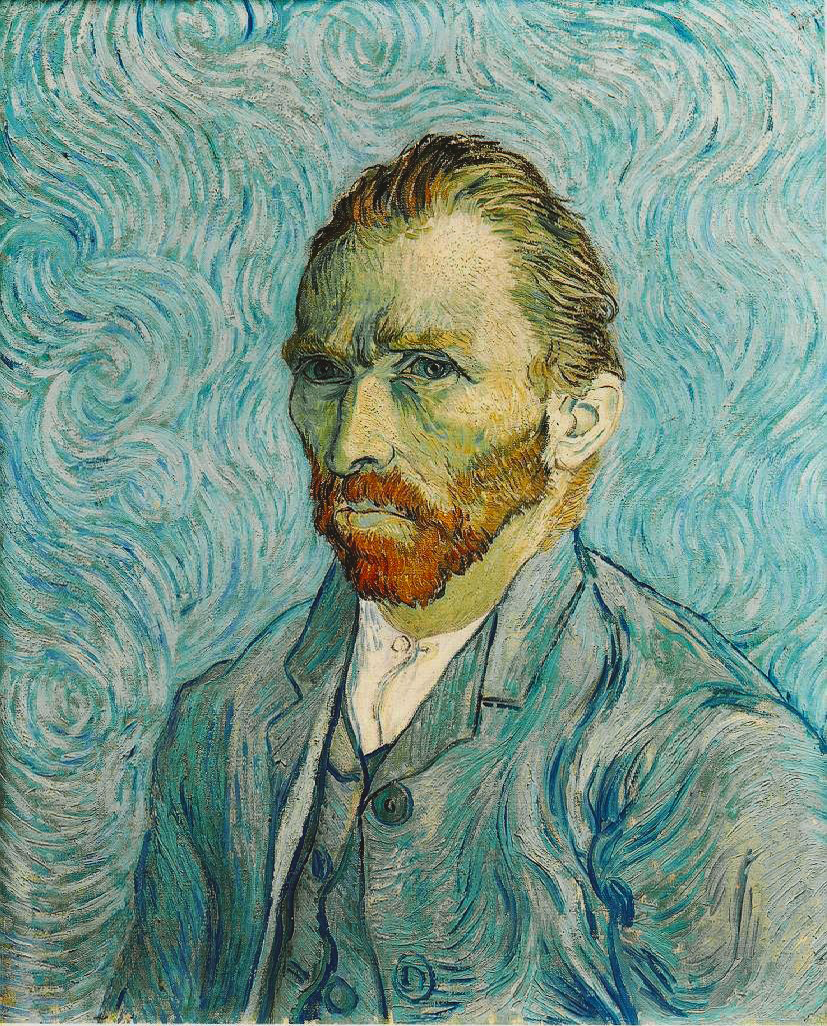
Vincent Van Gogh
Self Portrait
Green
Currently the most popular decorating color, green symbolizes nature. It is the easiest color on the eye and can improve vision. It is a calming, refreshing color. People waiting to appear on TV sit in "green rooms" to relax. Hospitals often use green because it relaxes patients. Brides in the Middle Ages wore green to symbolize fertility. Dark green is masculine, conservative, and implies wealth. However, seamstresses often refuse to use green thread on the eve of a fashion show for fear it will bring bad luck.
.jpg)
Frida Kahlo
Self Portrait
Yellow
Cheerful sunny yellow is an attention getter. While it is considered an optimistic color, people lose their tempers more often in yellow rooms, and babies will cry more. It is the most difficult color for the eye to take in, so it can be overpowering if overused. Yellow enhances concentration, hence its use for legal pads. It also speeds metabolism.

Bellany
Self Portrait
Purple
The color of royalty, purple connotes luxury, wealth, and sophistication. It is also feminine and romantic. However, because it is rare in nature, purple can appear artificial.

Andy Warhol
Self Portrait
Fun Fact: This painting just sold for $32.5 billion dollars at Sotheby's!
Brown
Solid, reliable brown is the color of earth and is abundant in nature. Light brown implies genuineness while dark brown is similar to wood or leather. Brown can also be sad and wistful. Men are more apt to say brown is one of their favorite colors.

Raphael
Self Portrait
Food for Thought
While blue is one of the most popular colors it is one of the least appetizing. Blue food is rare in nature. Food researchers say that when humans searched for food, they learned to avoid toxic or spoiled objects, which were often blue, black, or purple. When food dyed blue is served to study subjects, they lose appetite.
Green, brown, and red are the most popular food colors. Red is often used in restaurant decorating schemes because it is an appetite stimulant.
by David Johnson
Miz Art Question
Art I Students: What colors are you going to use in your portrait, and why?
Computer Graphics & Art II, III & IV Students: How will the knowledge of the psychology of color change your artwork? How will use color symbolically?
Read more: Color Psychology — Infoplease.com http://www.infoplease.com/spot/colors1.html#ixzz10jwCDYBT
Miz Art # 2 for week of 10/4/10
Saturday, September 25, 2010
Work Habits Self Evaluation Due Wednesday
ALL Art I - IV and Computer Graphics students MUST fill out a work habits self evaluation on Wednesday. We will be starting a new lesson on Thursday.
Art II - IV students should be starting their third project for the quarter soon to stay on track. Three final art projects are due by the end of the quarter.
Art II - IV students should be starting their third project for the quarter soon to stay on track. Three final art projects are due by the end of the quarter.
Thursday, September 23, 2010
Picasso Multi-Media Lesson - Next Step

After the glue has dried and you have added the layer of ink with your brayer, it is time to add color. Using either pastels, colored pencils or acrylic paint (or a combination of all three), add color to your artwork. Work around the black glue lines with your materials.
Colored Pencil: Prismacolor colored pencils have vibrant and saturated color. These pencils are very expensive, so take great care of them. Do not use the electric or wall pencil sharpener on the Prismacolors. Only use the oblong black sharpeners or the little silver sharpeners.
Colored Pencil will allow some of the black ink layer below to shine through. Blend layers of different colors for more depth in your colors.


Pastels: Pastels have a softer feel. Layering different colors with pastels can also create depth and visual interest. You have the option of leaving the layer of pastels as they are laid on or blending it in with your finger. Please keep in mind that pastels need a spray fixative when finished. This sometimes mutes colors or makes the pastels blend in with the ink (in this project).

Acrylic Paints: Acrylic paints bring the water-soluble quality of the block ink out. You will notice that the ink gets brought to the surface if your paintbrush has too little paint on it. Pput a lot of acrylic on your brush and pay attention to your brush strokes.

Remember: You MUST use at least one set of complementary colors. You MUST use bright colors in at least 2/3rds of your image. Use warm colors near or on your focal point. Wear your aprons and clean up thoroughly please!

Miz Art ~ Picasso's Guernica

Pablo Picasso, Guernica, 1937
Wartime Experience: 1937-1945
“Guernica, the oldest town of the Basque provinces and the center of their cultural traditions, was almost completely destroyed by the rebels in an air attack yesterday afternoon. The bombing of the undefended town far behind the front line took exactly three quarters of an hour. During this time and without interruption a group of German aircraft – Junker and Heinkel bombers as well as Heinkel fighters – dropped bombs weighing up to 500 kilogrammes on the town. At the same time low-flying fighter planes fired machine-guns at the inhabitants who had taken refuge in the fields. The whole of Guernica was in flames in a very short time.” - The Times, April 27, 1937.
The Spanish government had asked Picasso to paint a mural for the Spanish pavilion at the Paris World Exhibition. He planned to depict the subject “a painter in his studio”, but when he heard about the events in Guernica, he changed his original plans. After numerous sketches and studies, Picasso gave his own personal view of the tragedy. His gigantic mural Guernica has remained part of the collective consciousness of the twentieth century, a forceful reminder of the event. Though painted for the Spanish government, it wasn't until 1981, after forty years of exile in New York, that the picture found its way to Spain. This was because Picasso had decreed that it should not become Spanish property until the end of fascism. In October 1937, Picasso also painted the “Weeping Woman” as a kind of postscript to “Guernica”.
In 1940, when Paris was occupied by the Nazis, he handed out prints of his painting to German officers. When they asked asked him “Did you do this?” (referring to the pictures), he replied, “No, you did”. Whether those world-reknowned military brains were simply unable to perceive the symbolism of the picture, or whether it was Picasso's fame that stopped them from taking any action, the painter was not arrested and went on working. During the war, he met a young female painter, Françoise Gillot, who would later become his third official wife.
With his Charnel House of 1945, Picasso concluded the series of pictures that he had started with “Guernica”. The connection between the paintings becomes immediately obvious when we consider the rigidly limited color scheme and the triangular composition of the center. However, in the latter painting, the nightmare had been superceded by reality. The Charnel House was painted under the impact of reports from the Nazi concentration camps which had been discovered and liberated. It wasn't until then, that people realized the atrociousness of the Second World War. It was a time when the lives of millions of people had been literally pushed aside, a turn of phase which Picasso expressed rather vividly in the pile of dead bodies in his Charnel House.
Article is by Charles Moffat from www.arthistoryarchive.com
Question for The Miz Art Topic Number One:
How did Picasso's artwork comment on and/or document the atrocities of World War II?

Pablo Picasso, The Charnel House, 1945
Original article may be found at:
http://www.arthistoryarchive.com/arthistory/cubism/Pablo-Picasso.html
Miz Art # 1 for week of 9/27/10
Subscribe to:
Posts (Atom)